newspaper textual analysis
Textual analysis
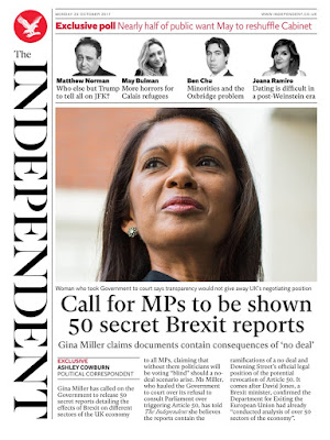
- There is a low, close up, angle shot of the woman in the centre of the page. This can be used to show her power and authority. It makes the reader know that the woman is dominant and an important figure.
- Her photograph is placed in the centre of the page showing that she plays an important role in the main part of the newspaper article.
- The title of the newspaper is written along the edge of the paper. This could be because the audience's attention would be drawn to the woman in the picture and the article rather than the name of the newspaper.
- The font used in the text is sans serif. This could be used to show that the newspaper is formal and meant to be taken seriously. The use of serif suggests that the target audience is mainly going to be adults not children (because serif font is more child friendly).
- Some smaller parts of the text are written in red. This can be used to immediately draw the target audience's attention to the specific text.
- There is a caption underneath the photograph of the woman. This allows the audience to know who the woman is and what her relation to the article is.
- The headline is in larger print than the article text. However, its not big enough to stand out. This may have been done so that the picture of the woman is the first thing that stands out to the audience.
- There are a couple of pull quotes in the article said by the woman in the photo.
- The subheading gives us an idea that the lead story is going to be something to do with brexit and politics- it is the folio of the article.


Comments
Post a Comment