Introduction to Newspapers
Media language.
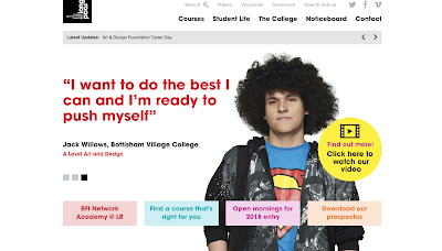
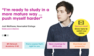

There are bright colours used to make the important parts stand out. The colours all compliment each other, to suggest that long road is a friendly, approachable and colourful place. All of the students look different and are both male and female, showing that the college is diverse and accepting of all ethnicities and genders. One of the students, josh, is wearing smart clothes making it seem like the students at the school are well respected and intelligent. Isobel, has bright pink hair to show originality. They used Isobel on the website to suggest that students are free to be who ever they want, dress the way they want and express themselves in whatever way they want. All of the students seem to be taking subjects that other students should take. For example, Jack is taking media but stereotypically he seems like someone who would take English and Isobel takes English but seems like someone who would take art. They have done this to break stereotypes and suggest to those looking at the website, that they can take whatever subjects they want.
Why does long road need to have messages and values?


Representation.
Industries and audiences.
Media industries
- Institution and industry are completely different terms.
- Example of media industries: music industry, film industry etc.
Institution- the values and ideologies of a media production.
(its a way to differentiate between products and can give the consumer an idea of "quality").
Long Road website
(its a way to differentiate between products and can give the consumer an idea of "quality").
Long Road website


There are bright colours used to make the important parts stand out. The colours all compliment each other, to suggest that long road is a friendly, approachable and colourful place. All of the students look different and are both male and female, showing that the college is diverse and accepting of all ethnicities and genders. One of the students, josh, is wearing smart clothes making it seem like the students at the school are well respected and intelligent. Isobel, has bright pink hair to show originality. They used Isobel on the website to suggest that students are free to be who ever they want, dress the way they want and express themselves in whatever way they want. All of the students seem to be taking subjects that other students should take. For example, Jack is taking media but stereotypically he seems like someone who would take English and Isobel takes English but seems like someone who would take art. They have done this to break stereotypes and suggest to those looking at the website, that they can take whatever subjects they want.
Why does long road need to have messages and values?
- To attract students in order to make money to pay staff and keep the school running.
- Competition against other schools.
Shell logo

- The yellow and red colour is symbolic for fire and combustion.
- The colours can also have connotations of passion.
- Bold colours that stand out.
- The shell looks like an empty petrol gauge.
- It also looks like a sunrise, being symbolic of routine as well as hope and optimism.
- Its shaped like a shell which has connotations of nature.
 Starbucks logo

- Its American (has a resemblance of the statue of liberty).
- It looks like a mermaid.
- The colour green is associated with money (in most countries, money is green).
- The wavy hair is soothing, making the audience feel tired and in need of a coffee to wake up.
- She has breasts, hence why the audience knows that she is a female.
- Her crown suggests royalty.
First impressions of this newspaper

- Big writing that stands out, so the audience can quickly see the main story.
- Theres a sans serif font used which makes it seem formal.
- The audience is mainly British people and other Uk citizens, this is because of the word "corrie", which is slang for the British soap opera that someone from a different country won't know.
- The words "trump" and "groped" are written in big white writing across the front of the page in the same sentence.
- Theres a picture of Trump looking smug making his scandalous news seem even more scandalous.
- It is structured like a magazine (theres too much information thrown into one page).
- The title about Trump seems to be making jokes about sexual harassment.
- Mainly targeted towards the working class because they would understand some of the things said in the newspaper (Eg: a large amount of working class people watch corrie).

Comments
Post a Comment