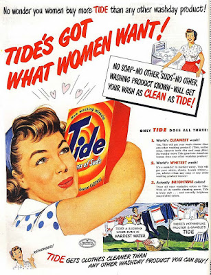
Tide advert
- Z-line- The way you see/read the text (in a "z" shape).
- Rule of thirds- the idea that an image is split into 3x3 squares.
- Headings and sub-headings- A title at the top of a page showing what something is about.
- Serif font- A type of font that looks like this (its more professional and formal).
- Sans-serif font- A font that looks like this (its less professional and its informal).
- Lexis- The choice of language being used.
- Mode of address- The way text communicates with an audience.
Wash product advert from the 1950's
 This advert seems stereotypical, claiming that it's women in particular that like to buy washing products. This shows that they think all women are stay at home moms who love cooking and cleaning etc. It shows sexism and proves that they don't care about equality. The woman in the cartoon is hugging the product, showing that she loves it and holds it close to her like its her child. This advert is aimed at women because the company/brand think they know what women want and they believe that women need this wash product as much as they need a husband or a child.
The advert is colourful, which usually isn't something you'd find in an advert targeted towards men in the 1950's. This is probably done because women (stereotypically) love the colour red. The colour red has connotations with love and romance. This makes it seem like a woman will look prettier to men if she washes clothes.
This advert has a lot of text (more than modern adverts now) this could have appealed to people at the time because it gives them a lot of information on the product and can be seen as useful to customers who wanted to buy it. The text used is sans-serif font. This makes the text look more child friendly, unprofessional but fun and interesting at the same time, making it more appealing to people buying the product who will believe that the product is fun and interesting.
There is a picture of woman in the poster, showing she is the focal image in the poster, therefore meaning she's the main character or the lead protagonist in the poster. She is wearing make-up and her hair is well styled, which is something that people wouldn't bother with when cleaning up. It shows that women are insecure, vain or are trying to attract men and feel like they have to wear make-up otherwise men wouldn't be interested in them.
The colour white is used a lot in the poster showing purity but also cleanliness. The washing powder is also used to "clean" and as well as the colour white, it also had connotations with
The use of Proairetic code shows that the woman is about to wash her clothes.
There are cartoons used in the picture this can appeal a younger audience, especially younger girls who may become inspired to become a housewife one day (like their mothers). The advert presumes a position of power and authority. This is because of sentence "no wonder you women..." this shows that they are looking down on women and women are second-class citizens and not as important as men. There word "whizz", used in the cartoon at the bottom shows that it is informal because it is a street word that only the working class would've used back then, showing that the poster is aimed towards working class women. The text also shows no diversity. This is because all the cartoon women are white showing that they aren't targeted towards people of colour and they don't care about coloured people. They use the word "whitest", in large red text to stand out and show that they believe "whiteness" means clean and brighter.
Tide:
- Its the number one brand in America.
- Designed specifically for heavy-duty, machine cleaning.
- Launched in 1946.
- They used print and radio advertising campaigns in order to quickly build audience familiarity with the brand.
Modes of address:
- The ways in which a media product "speaks" to an audience
- This can be done through a rage of colour, performance, editing and lexis.

Comments
Post a Comment