Advertising
- Codes and conventions- codes are systems of signs, which create meaning. There can be two types, technical and symbolic. Technical codes are all the ways in which equipment is used to tell a story in media text.
- Layout and design
- Composition
- Images/photographs - camera shot type, angle, focus
- Font size, type of font (e.g. serif/sans serif), colour
- Mise-en-scène – colour, lighting, location, costume/dress, hair/make-up
- Graphics, logos etc.
- Language – slogan/tagline and copy
- Anchorage of images and text
- Elements of narrative
Moving image
- Codes and conventions
- Camera work – framing, shot types, angle, position, movement
- Editing – pace, type of edits, continuity/montage Structure/narrative
- Sound – music/dialogue/voiceover
- Mise-en-scene – colour, lighting, location, costume/dress, hair/make-up
 This advertisement is selling a designer bag. They use a famous actress to attract people's attention. they have two pictures, one showing an actress and the other showing the bag in more detail. This close up emphasises the bag. There aren't a lot of words used in the poster however, they put the brand name in big, clear writing along the bottom of the poster to stand out. this makes people know that the brand is well known and glamourous.
Roland Barthes (key theory one)- semiotics
He talks about signs
Signs are:
- anything with meaning
- the thing that creates meaning
- the meaning thats created
He believed signs are split into two things
- sinifiers
- signifields
codes:
- Hermeneutic code- anything within a text/ media product that causes suspense or a question.
- Proairetic code- also known as action codes. they suggest that something is about to happen.
- Symbolic code- anything that has a deeper meaning for the audience.
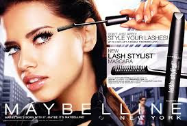
 This advert has a close up picture of the mascara they are promoting. Making the mascara look bigger makes it stand out and clearly shows people what is being promoted. The product is repeated over and over again.
There is a lot of writing on this poster which makes it seem like a cheaper brad (because if it was a more expensive brand they usually wouldn't have a lot of text). The use of text shows desperation to promote this mascara. The layout is more cluttered which shows it appeals to a working class audience rather than a upper class group of people.
Most of the text is in black so it makes it easier to read and the brand name is in white which makes it stand out from the other text in the advertisement. The subtext of "New York" shows glamour but it also shows that it might be expensive as well as a solution to a busy lifestyle for people who live in busy cities. This can also show that make up is important and a part of life.The brand name is written across the bottom of the poster so it can clearly be seen by customers. The font used also tells us that the brad is well established and fancy.
The model in the picture is what society would deem as good looking. This may attract customers more because if they used a model who is deemed socially unattractive then not as many people will be drawn to the product. A lot of customers may think that if they buy this product then their lashes will look like the ones of the model.
The close up of make up being applied shows mystery because why don't know why the model is applying mascara.
Theres a cold, washed out, blurry background however, the model and the mascara are bright and stand out showing optimism. The model is wearing a leather jacket, showing independence (this could appeal to a lot of women because it might be inspiring).

Comments
Post a Comment